
Hello Crafters! I was prompted after receiving the May 2025 Paper Pumpkin kit to do more. The Mountain Majesties inspired more creativity for me to use what I have. Here’s how…
Mountain Majesties Inspiration
The kit was beautiful as is, but mostly the Mountain Majesties inspired me to use my two-tone cardstock. The special thing about this cardstock is that one side of the sheet is the true color and the reverse side is a lighter shade of the same color. At the time, I only had one pack of this containing multiple colors Poppy Parade, Pool Party, Garden Green, Petal Pink, and Early Espresso – a combo pack. “Multi” packs are often offered to coordinate with DSP (Designer Series Paper) colors. You receive a couple sheets of each color, so it’s a nice way to try a variety of colors, especially when trying it for the first time. This particular variety is no longer available, but others are. Feel free to browse my online store.
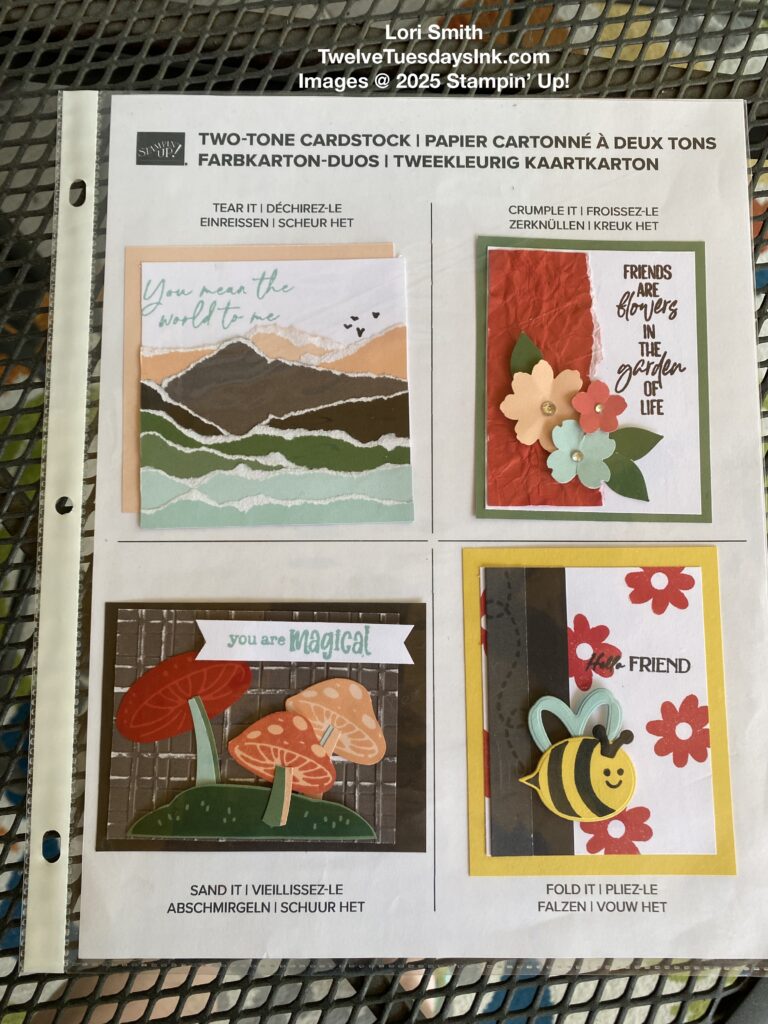
Here you see the sampler I made for our TwelveTuesdays Ink group to demonstrate different techniques crafting with it. I decided to use the aid Stamping’ Up! provided the demonstrators to display my examples. While the photos may not give you as good an idea of the two sides of color, my hope is that the links above will help you see this better.
Mountain Majesties
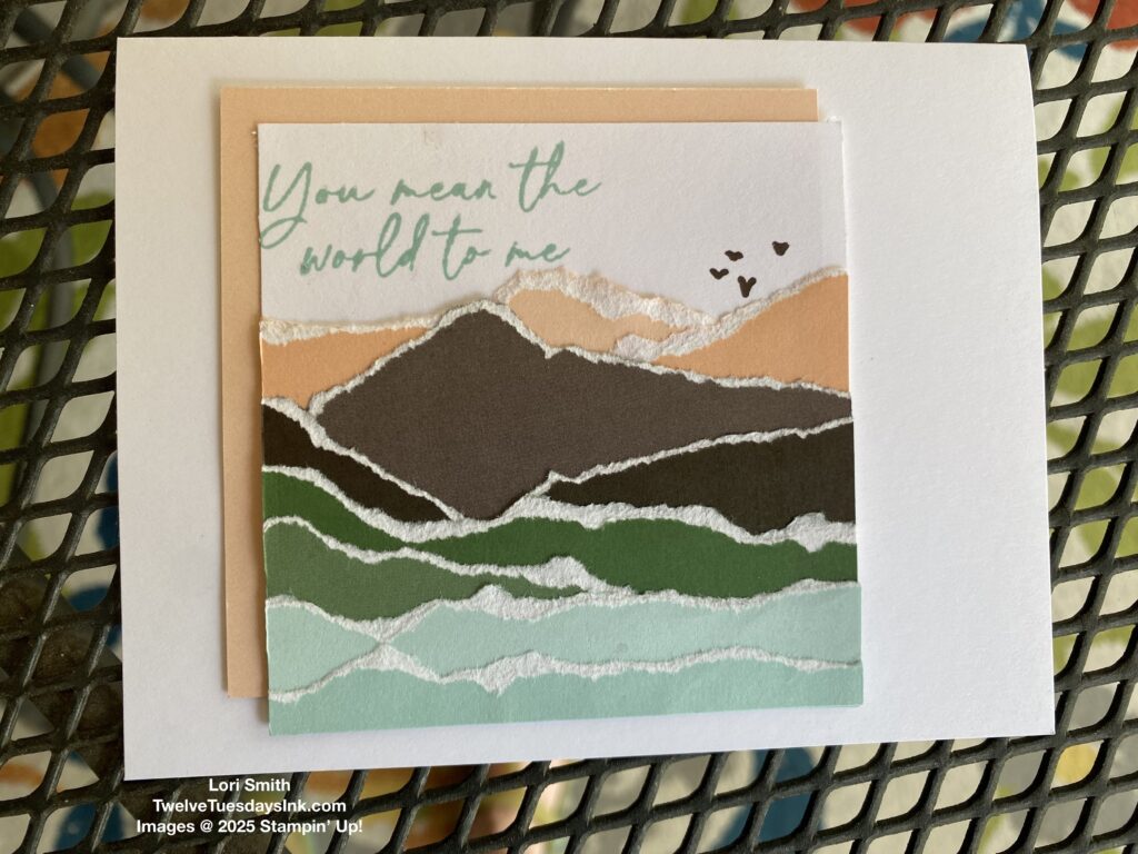
I created the “You mean the world to me” sample using the stamp set from the Mountain Majesties Paper Pumpkin kit. By mimicking the landscape of one of the card bases from the kit, and using what I had, I came up with this. I basically tore strips of the cardstock to reveal the white core, and layered the pieces to my liking before glueing it all together on a piece of white cardstock. I decided to add a piece of Petal Pink behind to help the image pop. Here’s how it could become a potential card.
Crumple Paper for Texture
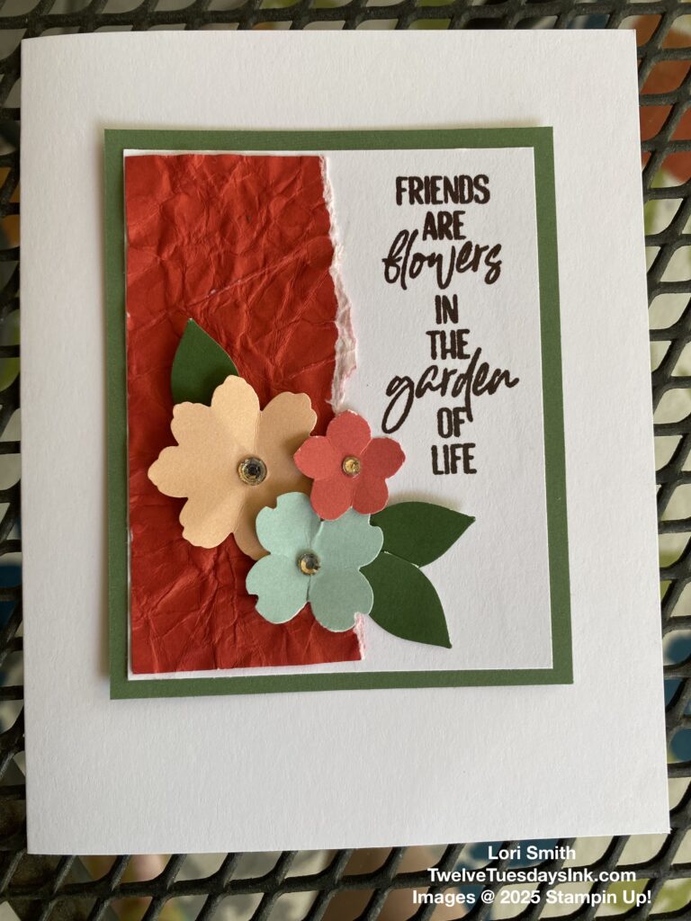
Now, because I was limited to only five different colored sheets of paper, I needed to get more creative. Again, by using what I had lying around my craft area. Here’s a little flower cluster with a crumpled paper background. This might be a good way to work out frustration. Haha! Just wad up your paper into a ball enough to distress it, so that when you flatten it out, the white core is slightly revealed. It looks like I also tore a side of it, combining both techniques. It’s easy to crumple two-tone cardstock, compared to the heavier cardstock, because it is of a lighter weight. The sentiment comes from You are Remarkable stamp set.
More Inspiration – Sand It
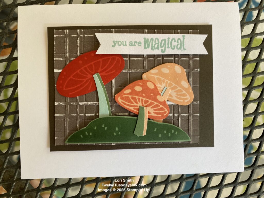
By sanding dry embossed two-tone cardstock, you can reveal the white core in a different way. Here’s an example of this technique. It creates a shabby chic look. I also stamped different sides of the paper to create variation of mushroom colors.
Inspired More – Simply Fold the Paper
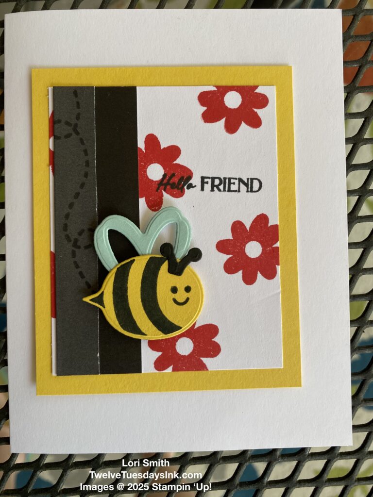
Yes, simply fold the paper to see both sides at the same time (light and dark). While I was digging through my stuff, I found a pack of black two-tone cardstock I forgot I had. I thought this would be perfect for a little bee background. I love how I was able to stamp the bee trail with black Memento ink on the lighter side of the cardstock for a subtle accent.
I layed all the examples on a white cardstock base, so you could see how they could potentially become greetings. But the main purpose for my sampler was to demonstrate to our group the versatility of two-tone cardstock. And all because the Mountain Majesties inspired more!
Follow this link to see other creations I made using the two-tone cardstock.
Thanks for visiting!
I like your mountain card!
Thanks, Jenny!